What this is
From 2016 to 2018 the UX mobile app team led a full redesign of Nationwide's flagship mobile app. We worked with several business and development teams in agile sprints within a massive insurance company.
9:41
The Nationwide app was completely overhauled starting in early 2017. This was the first step in the UX team's vision of what an app should be. After a few months at Nationwide I took on the Lead role on the UX app team. I led the team as we released a multimillion dollar project with over 100 stakeholders and tens-of-thousands of development hours.
We worked through some incredibly complex problems like filing a claim and creating an account.
The app redesign was released in January of 2018 with smaller updates happening monthly.
We're continuing to evangelize design throughout the company and listen to our customers to improve our experience.
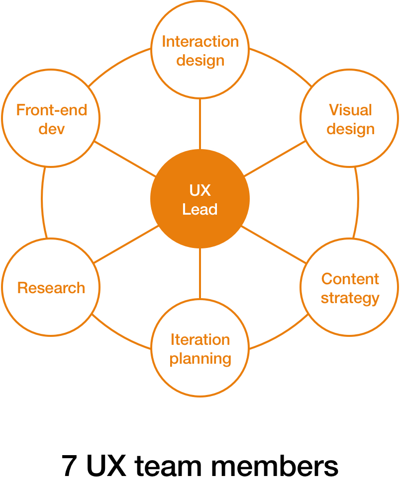
UX Lead Interaction Designer Coordinating agile iterations Planning evaluative testing Managing multiple project timelines
Competitive analysis Stakeholder interviews Design sprints Usability testing
Sketches User flows Wireframes Directional visual design and copy Various service design diagrams and maps
From 2016 to 2018 the UX mobile app team led a full redesign of Nationwide's flagship mobile app. We worked with several business and development teams in agile sprints within a massive insurance company.
I'll be focusing on the design of the app rather than taking on the leadership role. Much of my time was spent as a liason between design and business, I can speak to it but that's not the focus of the work I want to do.
The project was not a quick or high level set of concepts. This was a constant struggle to manage details and keep everyone involved from getting too far in the weeds.
The User Experience design team took on the strategic view of the app but the teams we worked with were hyper-focused on their specific silo. This is an ongoing challenge for the team.
I was hired at Nationwide to provide interaction design support for the app. The team brought me in to deliver the product.
At Nationwide the user experience design team is primarily consultory. We're 100% billable and, like an agency, if we lose a client because we don't deliver, we need to find a new client to pay our salaries.
For this project, design discretion lies with the business. The process is driven heavily by the development teams and the goal is to get something out of the door.
Before I joined Nationwide, the design team built a proof of concept for the ideal mobile app experience. This was based on customer feedback and had some baseline usability testing done on the prototype. They shopped this vision around the company's leaders to get buy in on the vision.
This prototype was driven primarily by a visual designer and a front-end developer and this was the foundation for the work we've been doing ever since. The prototype was intentionally future facing and focused on innovation over usability or established design patterns.
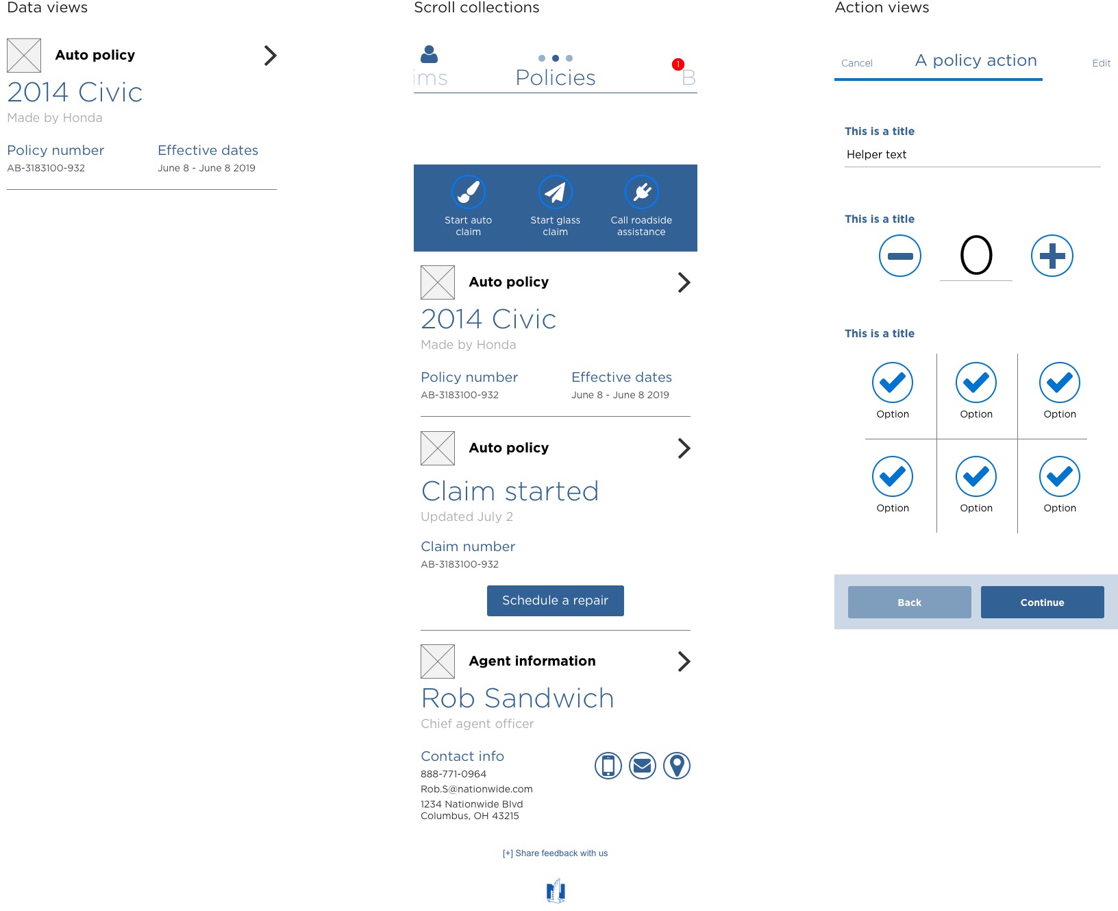
We started with the simplest patterns which we called data views. A data view is simply a chunk of information. They can be stacked to form a scroll collection and they can include access to action views, our version of forms.
Our enduring philosophy was that no customer should be more than 3 taps from the base scroll collections, the foundational navigation in the app.
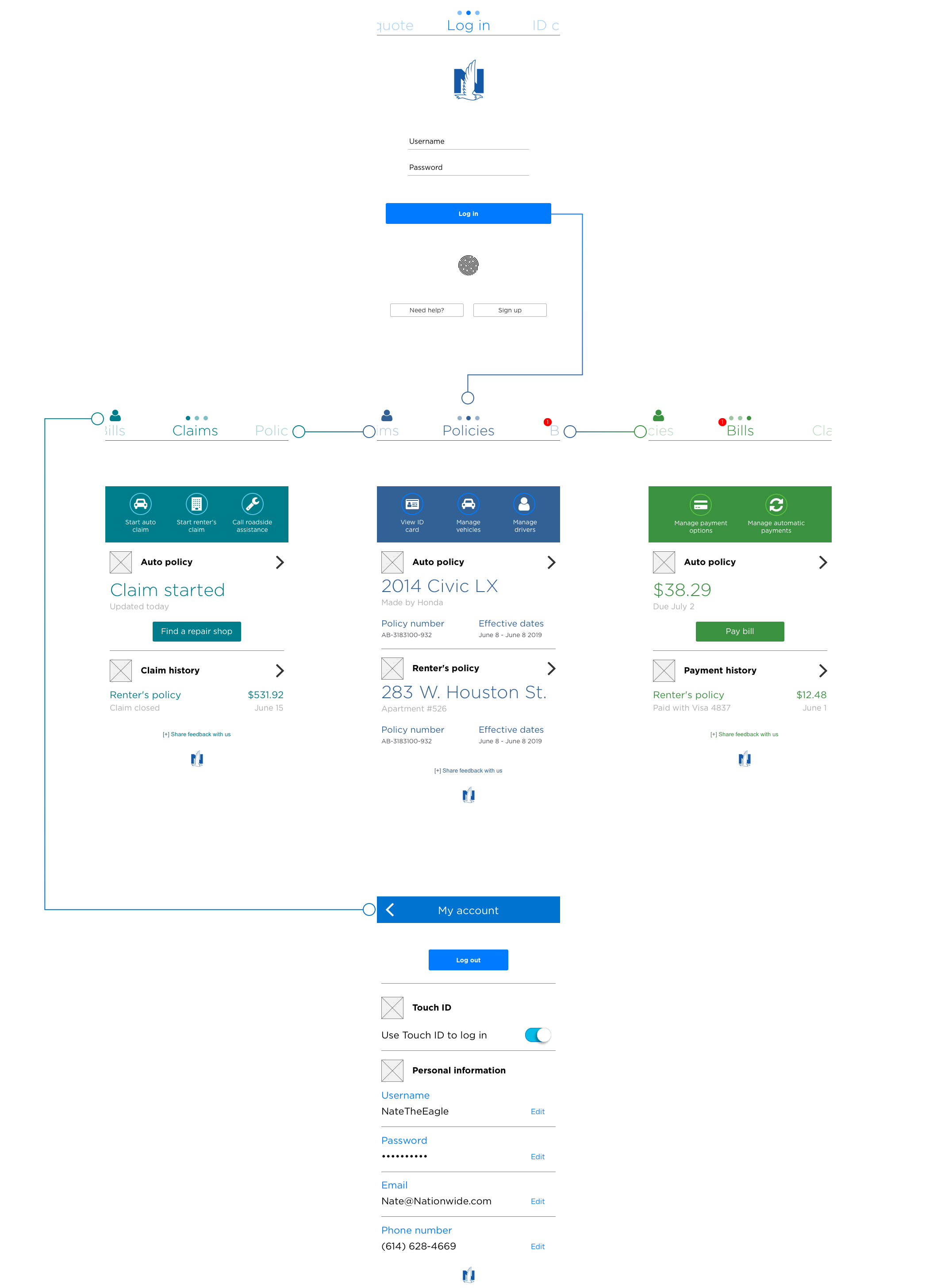
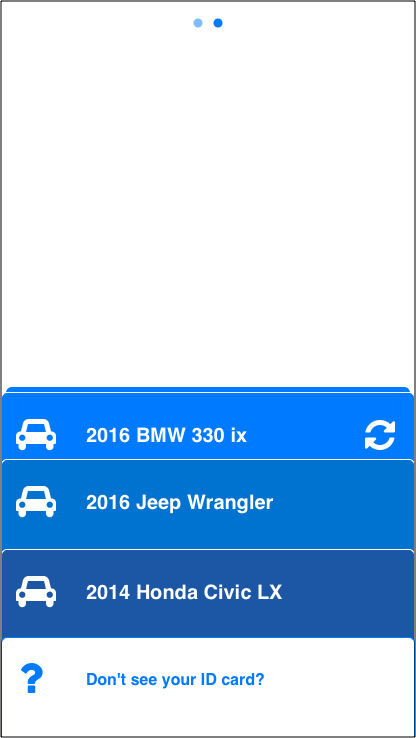
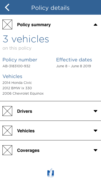
Our app has 5 sections, the logged out area is our Unauthenticated space. Once a customer logs in they can access Policies, Bills and Claims. From any of these scroll collections, a customer can access the account section.
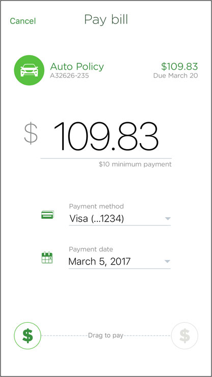
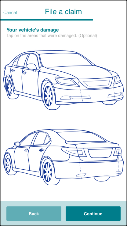
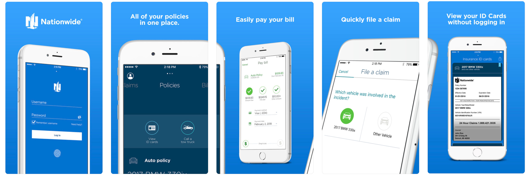
The features we included in the first launch of the app dictated how the app is organized. Our first launch included the option to view your ID cards, pay your bill and file a claim.
Initially we were able to convince our business partners to focus on quality over quantity. As more stakeholders became involved and the visibility of the app was heightened, this was far more challenging.
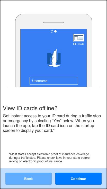
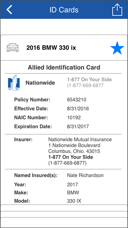
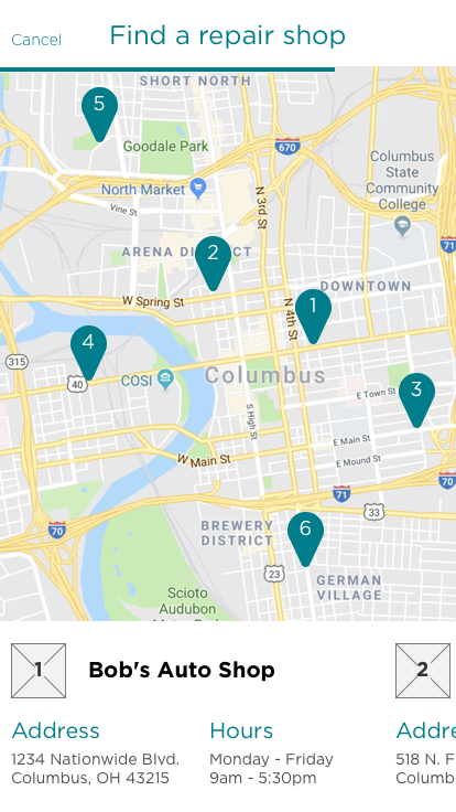
Insurance identification cards were the most used feature in the previous version of the app. Our initial idea was to include these in the device wallet but that was added to the backlog.
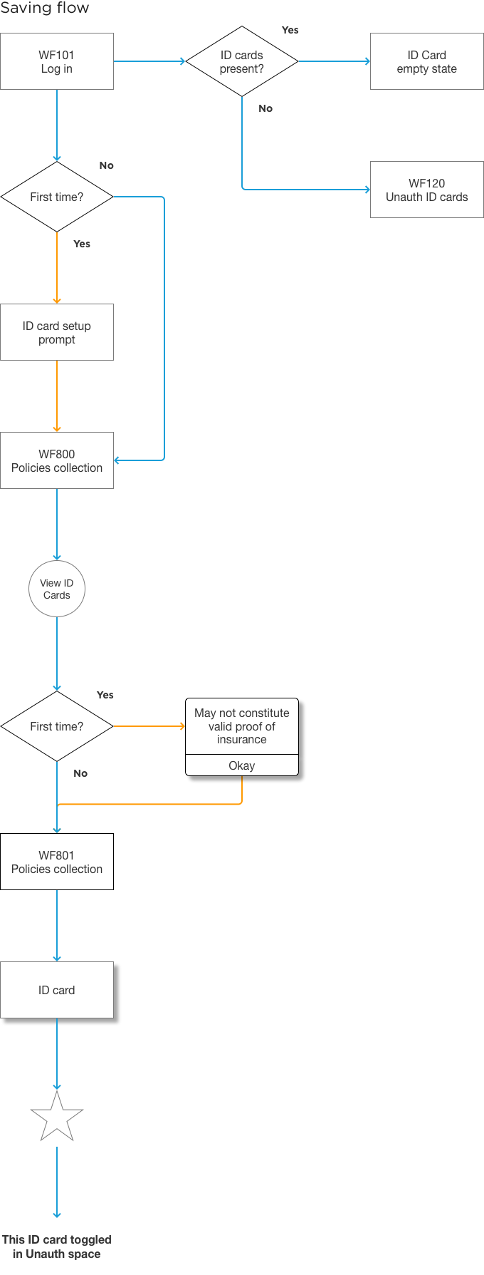
A legacy feature that was incredibly popular was saving ID cards and viewing them without logging in. Once a customer logged into the app, the ID cards could be bookmarked and viewed in the unauthenticated space.
We simplified this by adding a setup step with the first log in. This served to highlight the feature and give customers a quick option to use the feature without digging into the app to find it.
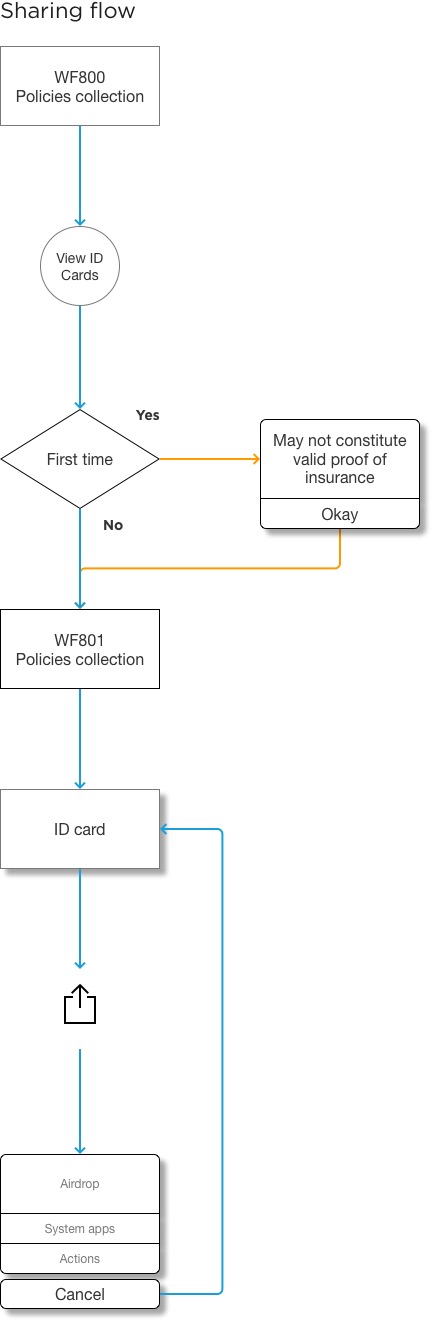
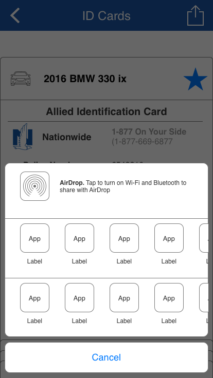
We included a new feature in this version of the app. We allowed customers to email, message or print ID cards. Insurance apps are inherently low touch, we understood this and, rather than forcing interactions, allowed our customers to use the feature in or out of the app.
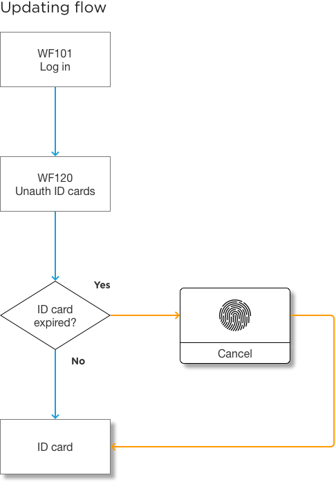
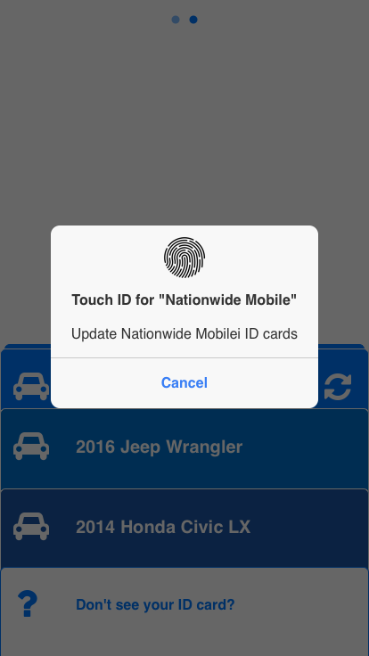
Another issue with a low touch app is the fact that ID cards expire every 6 months. Again, we wanted this to be as quick as possible but we had to work around technical and legal constraints.
Customers were required to log in to update the ID cards, this does include personal information after all. In the future we'd like to leverage push notifications but these weren't available at this time.
What we could do is alert the customer that some ID cards are expired and give them an option to authenticate, with Face ID or Touch ID, to update those ID cards.
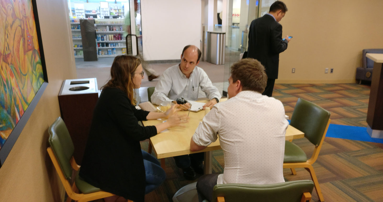
Non-disclosure agreements at Nationwide are strict. My preferred method of testing these features would be to find potential customers on the sidewalk or in a local coffee shop. Instead we had to find potential customers within our own lunch rooms. We aimed for employees with less technical backgrounds to avoid skewing the results.
Our research team was swamped at the time, technically we had 18% of a researcher but much of the test script and moderation fell on me.
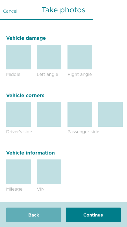
The Nationwide mobile app launched in January of 2018 and we've continued to update it with monthly releases. Since launch we've added the ability to file a claim with a few photos, enhanced the payment options we offer and added the ability to make changes to a policy.
Since launch, we've added 5 development teams and 3 interaction designers. With the app scaling so much, so quickly, a design system has become essential to maintaining the consistency of the app.
My role has become the gatekeeper for all things mobile. I've spent most of the summer and fall trying to keep the design team's efforts consistent and connect the dots between disparate projects.
This was a long project, not just the timeline but emotionally. Working with 6 teams, understanding UX as an agile process, launching an app and leading a team are a challenge individually. I did all of them at the same time.
I'm happy with what we built but as always, I wish I started with what I know now. After over a year at Nationwide I'm still learning about teams that exist on the fringe of our work.
The app will continue to exist within the framework that we've built and it will expand for several years. We created a great start for the app and the workflow but there's plenty of work left to do. Change takes time at a company this large. It's not just a design sprint, it's a design marathon.