Flipping? Awesome
I had a number of ideas for displaying the new information in the space we had. The card flip seemed the most appropriate, functional way to balance the product at a glance, the details and the other products in the bag.
$379.99
$449.99
$9.99
$12.99
$14.00
$19.99
View bag
To the most loyal Kohl's customers, this is the shopping bag. The first iteration of The Mini Bag was released in 2014 and led to a substantial lift in conversion. Customers adopted this as an easy way to check in on the items they had put on hold.
With our fair share of constraints we added more useful information that kept customers engaged in thier current flow rather than moving away to a new page.
Project Lead Interaction Designer Built prototypes Contributed to the testing protocol
Evaluative usability testing Stakeholder interviews Prototyping
Sketches Wireframe documentation Directional visual design and copy InVision Prototypes
This feature was originally designed as a preview and the result shows. There's just enough information and to view more means navigating to the full shopping bag.
As I started to sketch though ideas and share them with stakeholders, we uncovered our constraints. This was meant to be a small project and a quick win. I took the essence of some of our bigger ideas and started to work from there.
There were a lot of ways to solve this problem but there were not a lot of good ways to solve it. In addition to the new content I had to keep in mind a complex discount model which included Buy One Get One, Gift with Purchase, and tiered (50% off your second item) or group (3 for $10) priced items.
I had a number of ideas for displaying the new information in the space we had. The card flip seemed the most appropriate, functional way to balance the product at a glance, the details and the other products in the bag.
$9.99
$12.99
Early in the process I realized the size I was working with was roughly equivalent to the size of an Apple Watch screen. With that in mind I took inspiration from their design philosophy.
I designed this feature as a utility. We didn't need to hold someone's attention for hours but we did have to compete with an enormous amount of advertisemnts on the page. If a customer can find what they need quickly they're more likely to convert.
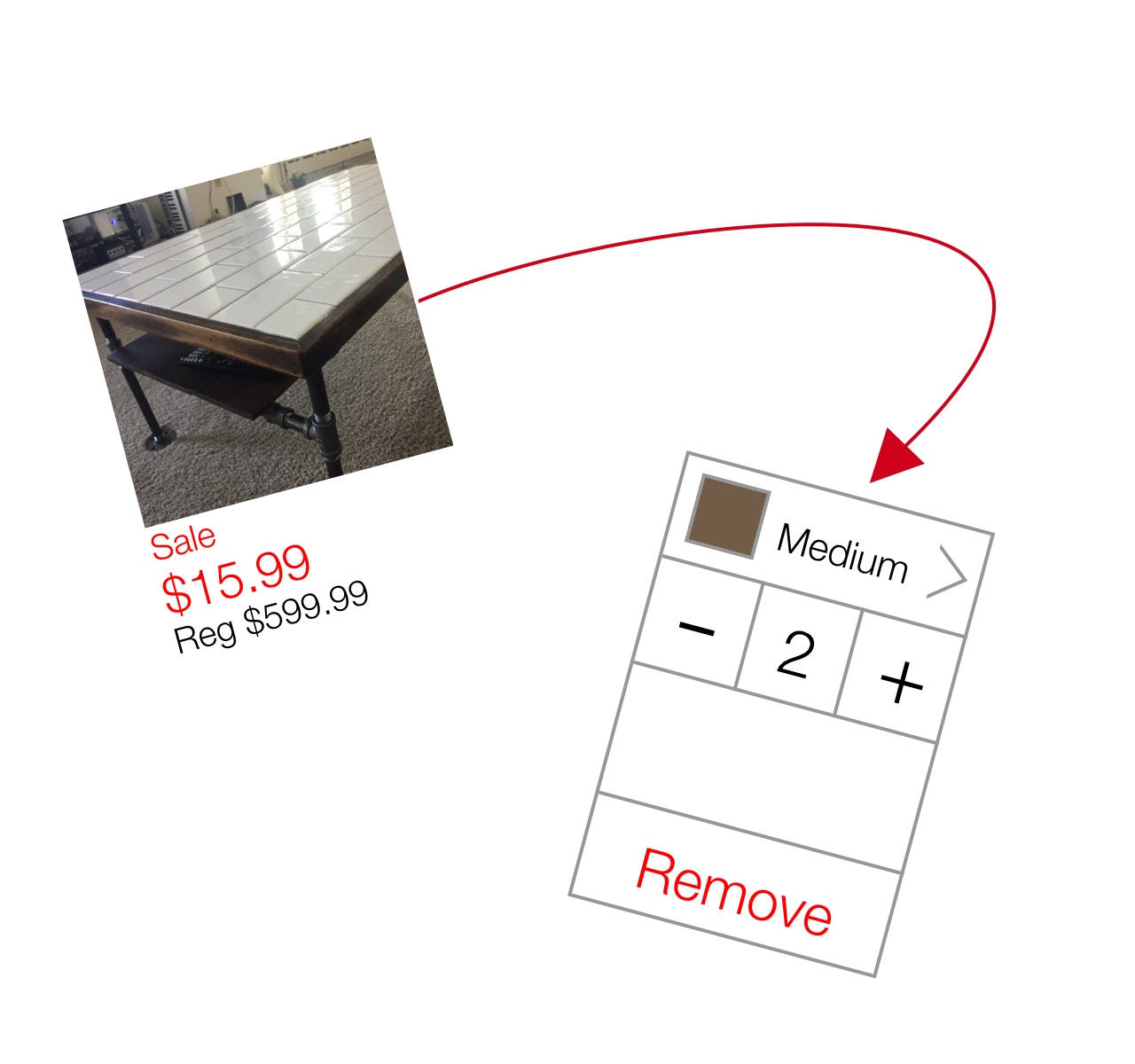
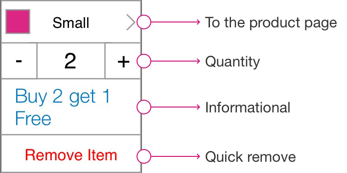
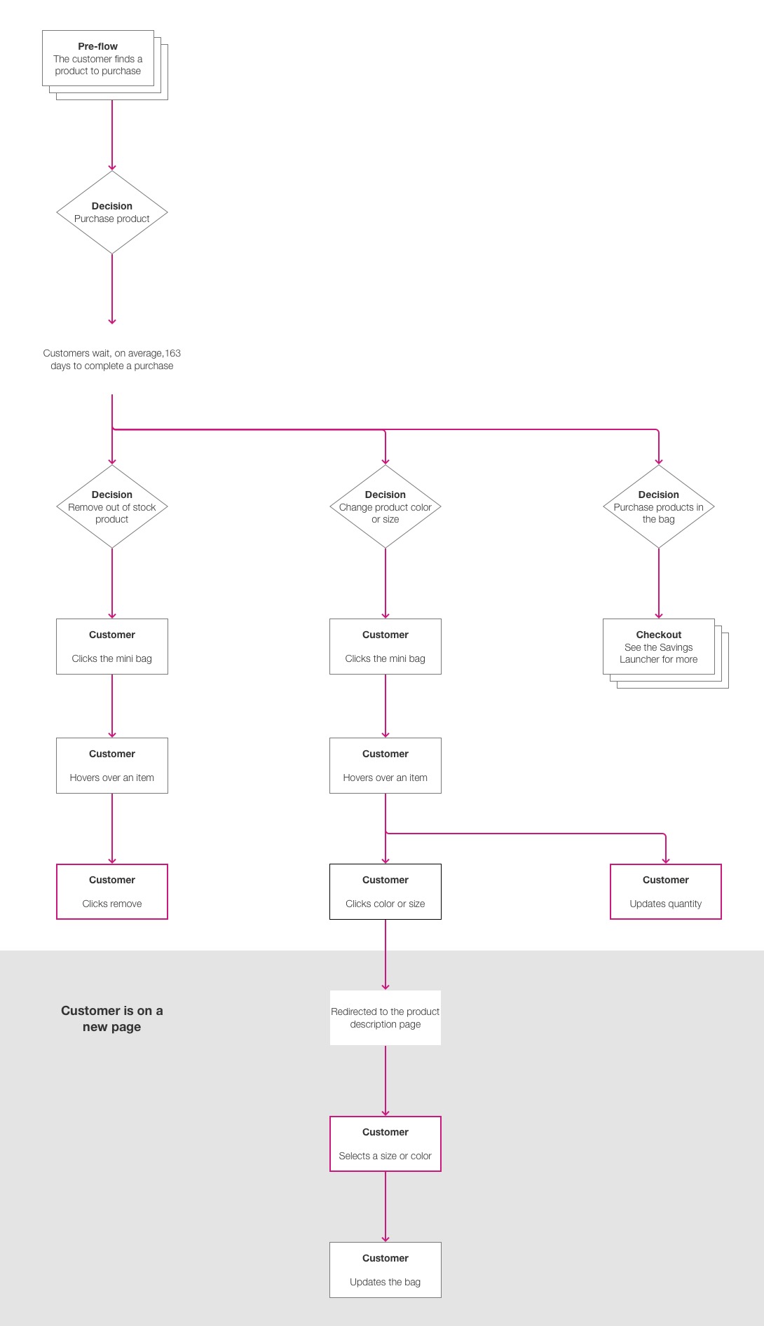
The key actions were not in The Mini Bag. Instead a customer would have to navigate to the product page and update size, color or quantity. To remove an item, the customer would have to go to the full shopping bag.
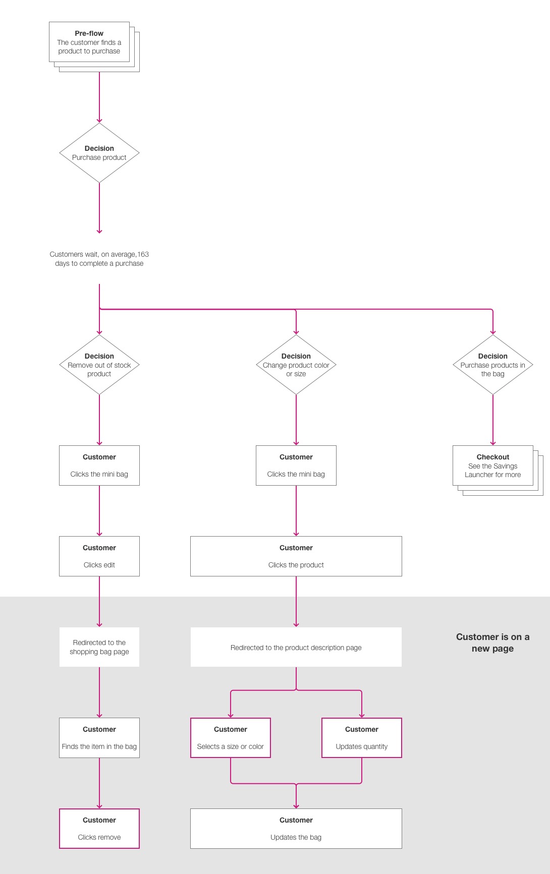
Allowing customers to see more information on the back of a card meant they can accomplish more key actions and get more information without leaving the page.
$449.99
$379.99
$449.99
Free
with purchase
Free gift
Out of stock
Cards were created in a modular way. Some products don't have a size or color. Some are Buy One Get One Free. Some have a sale price and some are out of stock.
September15
October1
October20
October31
November12
November25
December10
December31
January18
Replay ↺
That's how long, on average, customers wait to check out. As we were testing the card design I wanted to understand a customer's motivations given that timeline but we couldn't ask someone to come back in 6 months.
Instead, I put together a quick animation. In the middle of the test a customer would be walked through the next 6 months, complete with illustrations for the seasons. This provided a break from the tasks, it distracted the customer from the action they just took and it was as close to a reset button as we could get.
9:41
www.kohls.com
Back
Saving $19.85
Autopilot
Stacking offers
$10 Kohl's Cash
Expires tomorrow
$5 off $50
Home purchases until Tuesday
15% off
Anything until Friday
We learned a lot during this project. The most valuable lesson was just how complex the Kohl's discount model really is. With the new knowledge we started on our next project, envisioning the future of checkout.
This will always have a special place in my heart as one of my first professional design projects. The shortcomings of my process are pretty obvious today but at the time I was just starting to figure things out.
I am glad I took a small project and made it a big project. Without that we may not have come up with many of the ideas that made it into our larger checkout redesign.
We worked primarily with offshore development teams for this one. They nailed that card flip animation but communication is so much easier when you can run down the hall and talk to someone. I don't miss creating 30+ pages of documentation for those teams.