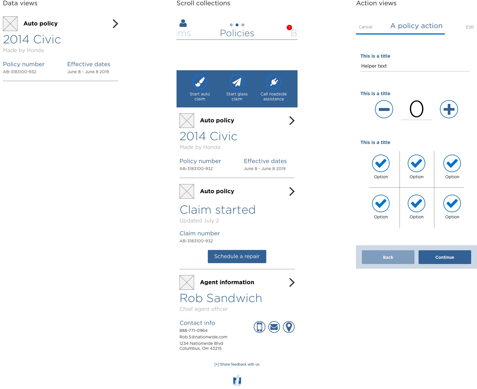
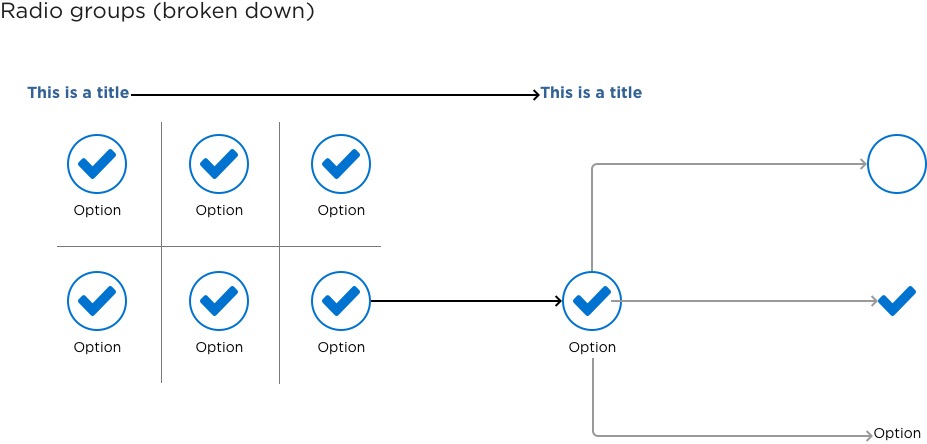
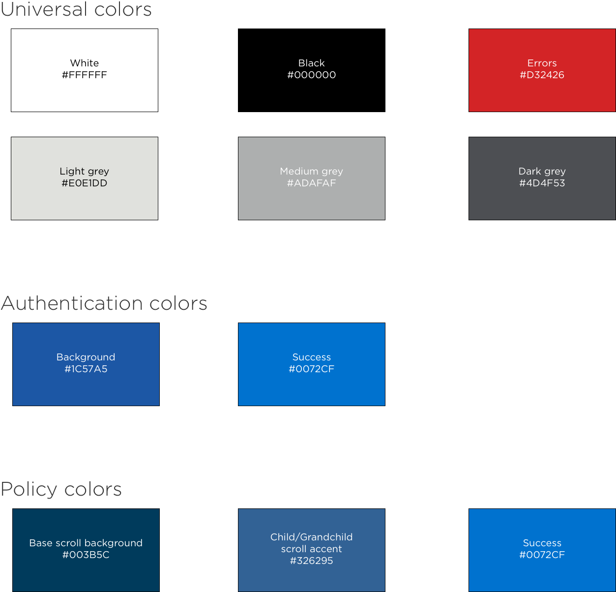
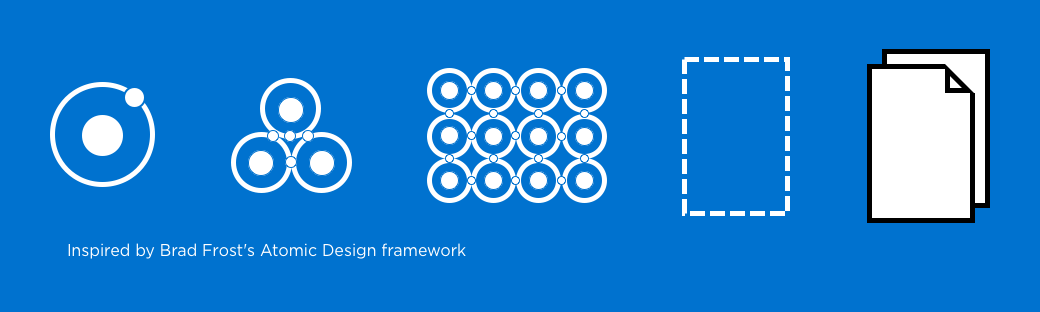
Nationwide

The design system

Scaling a newly redesigned mobile app

Consistency is key

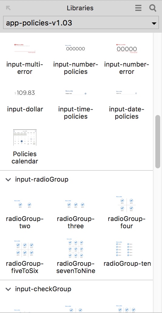
After we launched our mobile app in January of 2018, our one development team became six development teams. The mobile app UX team was tasked with onboarding these teams to the app and keeping the code base consistent so we could continue to build on the foundation we'd created.

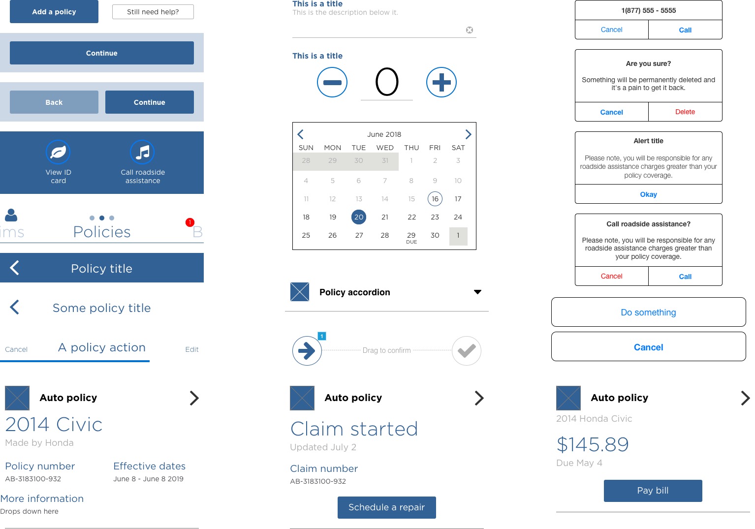
The last Nationwide app was bloated and updates, even integral experience updates, were considered too costly and time consuming for the development teams. We had to avoid this moving forward if our app was going to achieve the blue sky vision we set out for.

As with many design systems, this was inspired by Brad Frost's Atomic Design framework.
Check it out.

Roles

UX Lead
Interaction Designer
Front-end developer

Methods

Competitive analysis
Stakeholder interviews
Design sprints

Artifacts

Sketches
Design patterns
Wireframes
Directional visual design and copy

A quick recap on the Nationwide app

We redesigned the app from 2017 to 2018 to be a foundation for future work. New features and information can be added within the modular framework that we created.

As the project moved from one development line and one UX team to 6 development lines and multiple design teams, we needed a way to communicate the design patterns and hold everyone accountable for the consistency of the application.

Breaking it down

We started by taking an audit of the existing patterns. The same 6 people had done all of the initial interaction design, copywriting and visual design work so consistency wasn't an issue.

The work we did showed. All of our patterns were easily broken down. Without strictly thinking about a design system, we made the app as consistent as it could be. Some documentation existed but it was far from a system that could be shared with six design teams.

Building it up

In addition to the components, we included several templates for everyone to get started. This furthered the consistency so we could look from the micro-level to the macro-level.

Reusing components as a developer

Each development team has a limited amount of mobile expertise, in some cases that is a single developer with little experience outside of college. The focus for most of these teams is on back-end systems.

The best way for us to help was build components as standalone interactions. The development teams could then copy and paste those snippets and hook them up to API's and other systems. In this model UX becomes the gatekeeper for consistency across the app.

Reusing components as a designer

UX owns the experience on the app, we also own the front-end development so we build the components for the development teams to consume and reuse.

The wireframes

Most of our wireframes were made by copying patterns from other parts of the app. This was time consuming for one interaction designer to keep up, for four or more designers it was nearly impossible.

The first step in building the design system was to get the wireframes in order. We had more and more developers and business analysts who had never worked on the app getting involved in the process and our visual styles for most of these patterns were unlikely to change so we created 2 sets of components. First was a work-in-progress greyscale set, next was a full color, more final, set.

The flows

Flows are a first step for me when figuring out how a feature or set of interactions will play out. They often uncover details that are not apparent when you dive into screens.

Over time we created our own way of diagramming these interactions that were accepted and used by our partners. After the wireframes, we built a set of reusable flow components with some templates for newer designers to get started.

These flows were actually inspired by Boss Keys, a YouTube series by Mark Brown. It's rad,
check it out.

Modifiers

Our app has 5 sections, each with a different color scheme. There's the brand blue for authentication, dark blue for policies, green for bills, teal for claims and a light blue for a customer's account information.

Patterns are consistent across each of these sections, a head always looks like a header, an input always looks and works like an input. We decided to break slightly from Atomic Design here and create "modifiers" or color schemes for each component.

The way I think about it, modifiers change how something looks. They can be managed with CSS.

Overrides

A second departure we took from Atomic Design was with "overrides" or controls that changes how something works. These are things that can be managed in HTML.

We were using Axure but overrides work pretty much like they do in Sketch. Patterns have designated controls that can be overridden and that changes the function they serve.

Moving forward with this philosophy, we could keep our inputs consistent at a micro level. Dropdowns, single inputs, location, time or date pickers have the same base pattern with different controls.

Code snippets and documenting the components

We had our patterns audited and our wireframes built. The next step was to create something our development teams could use. The most useful thing we could offer was code snippets.

For our designers and our business partners we included some context about the patterns and using them.

We looked at other design systems but ultimately we landed on something more bespoke. It was heavily based on our situation with the development teams.

Let's work together

I'm looking for new problems to solve.

Get in touch

Hi@Joelski.design

⌘ + C to copy

or open Mail